iPhone vs Android: The secret sauce behind Apple’s high-end domination

In the ongoing tug-of-war between Apple and Android, one point consistently tips the scales in Apple’s favor: its ability to deliver a polished, seamless user experience. The new Vehicle Motion Cues feature in iOS 18 is the latest notable example. It isn’t the sort of flashy innovation like AI, but it’s an excellent quality-of-life booster and a great illustration for the point I want to make here.
Vehicle Motion Cues is designed to reduce motion sickness when using your phone in a moving vehicle. It works as soon as you step into a car and disengages the moment your journey ends – all without requiring any input from the user. It just works. This is what sets Apple apart, and it’s where Android phones often struggle to match the polish.
Android’s weak link
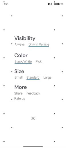
Android apps which aim to provide similar functionality like Vehicle Motion Cues, like KineStop and MotionEase, are more or less similarly successful at reducing the feeling of unpleasant motion sickness when operating a phone in a moving vehicle. However, there are critical gaps in the user experience which simply can’t go by a discerning user.


KineStop MotionEase Take KineStop, for instance. It often starts as expected, but I’ve found it to often remain active long after I’ve arrived at my destination. In one instance, I was walking from my car to the office, phone in hand. Despite the clear change in motion, KineStop mistook the shaking from my steps as vehicular movement and stubbornly remained active. Rather than simplifying my life, it added needless friction, as I had to manually disable the feature.
In my experience, MotionEase, which seems to mimic the way Vehicle Motion Cues look and feel most closely, often faces the opposite problem – it’s slow to engage. During a taxi ride where I intentionally sat in the backseat to test its effectiveness, I felt that familiar wave of nausea right as the taxi driver hit the brakes to stop at the first traffic light. Why? Because MotionEase hadn’t figured out that I was in a moving vehicle. Thank you very much, app developer who couldn’t figure out how to make the app do what it was supposed to do. Then I simply went ahead and manually enabled the feature. The nausea disappeared almost instantly.
Such inconveniences might seem trivial on paper, but the truth is they significantly detract from the experience. Oftentimes, such an apparently minor flaw can be the difference between people using the feature and leaving it in on the bench.
Tech is great when it can get out of the way
Contrast these frustrations with Apple’s Vehicle Motion Cues. In similar situations, it consistently performs with precision. The feature activates the moment you step into a car and disengages just as seamlessly when you step out. Walking to your office or hopping into a taxi doesn’t seem to confuse it.
This kind of reliability once again illustrates Apple’s winning approach. It consistently aims to offer functionality that feels invisible – because it simply does its thing without needing additional input from the user. It’s the small things, like this reliable auto-start/stop of Vehicle Motion Cues, that again and again prove Apple is on a different plane when it comes to user experience.
On Android, such features typically need to be adopted by Google and get deeply integrated into the operating system to achieve the same level of reliability.
In the battle for each and every consumer, Apple’s ability to consistently deliver “it just works” moments remains unmatched. Vehicle Motion Cues in iOS 18 is just one more proof of this. Obviously, Android has unique selling points of its own, which allow it to be highly competitive across a variety of niches. But when it comes to the premium market segment, the ability to satisfy the need for seamless, “it just works” experiences continues to be largely an Apple specialty.